Rebecca | November 18, 2020 | 0 Comments
Throughout the years studying and working as a spatial designer in many different disciplines, I have noticed there has been one simple basic underlying approach to the design process that all designers seem to agree on. When approaching the design of a garden, a planting design, graphic design, a theatre set, or even a basic portrait painting, you first need to work out the basic shapes and forms of the image before dressing it. For a theatre set, for example, you rip up pieces of card, foam or whatever suits, you find the shapes you want and only after the shapes and forms are confirmed, do you then think of colour and finally the dressing. In planting design, you decide on all of your tall plant positions, your lower plant positions, if a tall object needs to be balanced with three small objects, will they be round plants or triangular,and so on. You then explore the textures and what contrast leaf sizes you will use and where. If you don’t consider texture you can end up with (what the lecturers in Caple Manor college referred to as) green fuzz. The colours and flowers come next.
The following passage touches on the importance of balance, form, texture and scale, and how we can really create something wonderful by always paying attention to these principles and keeping them in clear focus.
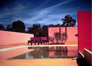
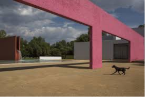
 Luis Barragans Equestrian Estate, Cuadra San Cristobal in Mexico.
Here we can see a great example of solid forms and straight lines demonstrating balance, form and scale. It is a simplistic play with shape and form rather than framing views or emphasising the contrast of form and texture. The shape and form and their relationship to each other are the entertainment.
Luis Barragan’s layouts and patterns may have been largely structural, but the treatment of shape and form can be applied anywhere in design from graphic design layouts to framing a scene for a movie through the lens. I will always remember during my final degree year at Dunlaoighre College of Art Design and Technology in Dublin, we were invited to a film seminar at UCD (University College Dublin). I remember very little of the day but the one part I do remember was how one lecture was based on creating grid layouts on acetate and holding them to the lens to line up all the items in the frame in a widescreen balanced layout. I loved this idea and to this very day when presenting to clients, I still reference creating widescreen views in the garden just like a television screen. When I look at Luis Barragan’s Ranch images my thoughts drift back to what I learnt that day at the seminar in UCD and how amazing design is and how the same principles transform through all disciplines of design.
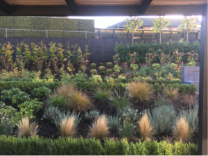

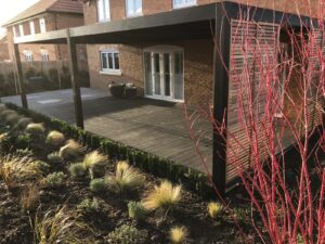
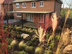
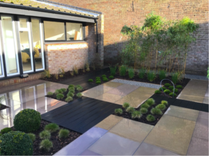
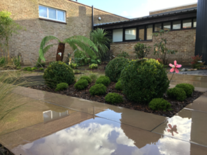
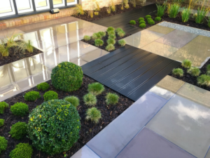
Oakleigh Manor Garden Design & Build Project, Sheerness
In these images, the garden could be mistaken as just another random design. But we know better. The design, like Luis Barragan’s designs, shows the treatment of plants as forms in the garden, rather than relying entirely on solid structures. The plant size, texture (leaf size, shape and surface appearance), form (plant structure), straight-line layout and colour contrasts builds the landscape, reflecting the same principles applied by Luis Barragan. There are some hard structures in the design, such as the water feature and steps. They introduce patterns and the sound of movement. The large Western Red Cedar contemporary pergola introduces framing as seen in Tadao Ando’s ‘Church on the Water’ and Zumpthorpes Thermal baths. A lot of the designers associated with what we widely recognise as contemporary design have based their design work on Japanese traditional designs, so it is no coincidence that this garden visually reflects the Japanese design principles.
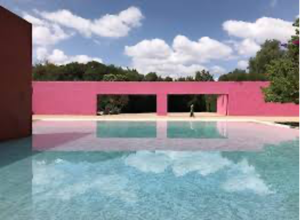
 Luis Barrragans Equestiran Ranch – The Ranch framing views.
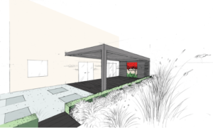
This image shows hows Barragan’s use of shape and form informed the design of this garden in Sheppey.
Below are some more images showing my inspiration behind this garden design, showing shape, form and balance in Japanese Architecture. The images below show Japanese architecture and its relationship with nature.
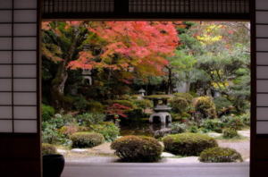
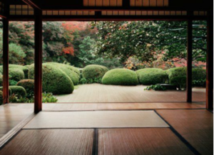
https://www.pinterest.co.uk/pin/174725660514191517
Planting in a garden is such an amazing added advantage to a designed space. When designing a building, you have all the hard materials to play with and you can control natural light to perfection. When designing outdoors you have hard materials to play with, but light can be a little harder to control than in interior spaces. This is something I always strive to manipulate as best I can, but having said that, designing outdoors has one major, and I mean major, advantage. Designing outdoors you have plants. They are living objects and they are an amazing material to have in your arsenal. As seen in the Sheppey garden design, they can be used for form and shape. Another amazing way to use plants is for adding texture to space. When I say texture, I don’t just mean the feel of the plant I mean the leaf size. Contrasting leaf size can make or break a simple design.
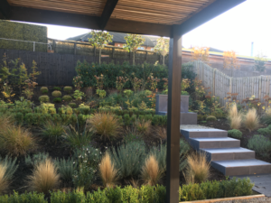
Oakleigh Manor Courtyard Garden Design & Build, Whitstable
This garden in Whitstable seen here (during installation) was an exercise in contrasting leaf texture as well as contrasting plant form. The colour palette was largely green to emphasise the contrasts. The contrast in texture is explained in more detail in following blogs where we look at contrast as a separate title.

